Incredibly honoured. We won India’s best design award 2018 @bestdesignaward @indipoolmag for Habba Bioscope. Thank you for the lovely trophy and @habbaorg for providing me the opportunity to work on the app #ux #ui #thepoolshow #ibda #poolmagazine #design #productdesign #uxdesign pic.twitter.com/yBTlwYNPId
— vivek (@treevivek) September 8, 2018
Category: Design
SensyApp wins the design in India Challenge by Qualcomm India
Proud to see my design work @SensyApp for winning the design in India Challenge by @qualcomm_in #ux #ui #design #mobile #product #QDIC https://t.co/GBXgiDlhJe
— vivek (@treevivek) June 22, 2018
I am happy to see my work appreciation by Qualcomm India for SensyApp.
Design in Tech Report 2018
Today’s most beloved technology products and services balance design and engineering in a way that perfectly blends form and function. Businesses started by designers have created billions of dollars of value, are raising billions in capital, and VC firms increasingly see the importance of design. The third annual Design in Tech Report examines how design trends are revolutionizing the entrepreneurial and corporate ecosystems in tech. This report covers related M&A activity, new patterns in creativity × business, and the rise of computational design.
– John Maeda
Nintendo Labo
Nintendo Labo combines the magic of Nintendo Switch with the fun of DIY creations. This is so very lovely!
A beautiful e-paper magic calendar
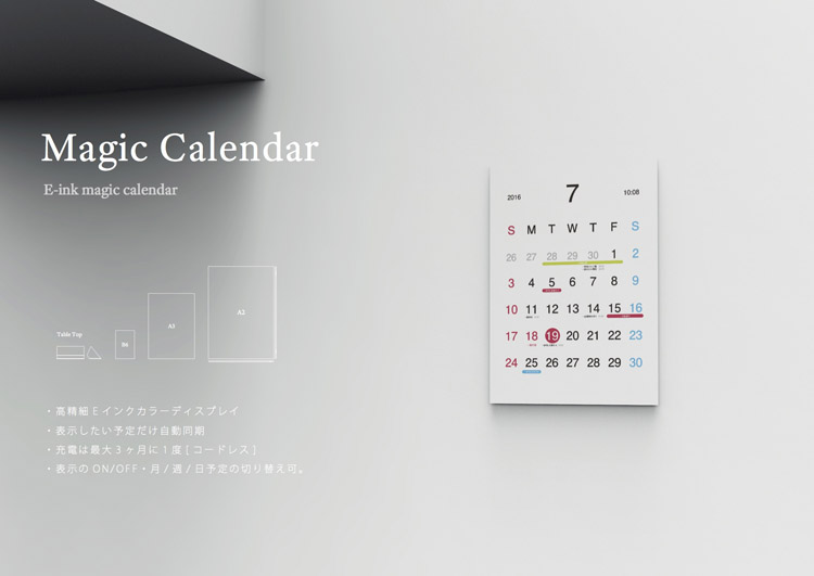
The Magic Calendar by Kosho Tsuboi, is a beautiful e-paper calendar that syncs with a smartphone to display your schedule and lot more. The project is associated with Google’s Android Experiments and hopefully we will see it live.
This is so cute and i love to have it.
Screen Time – design effective cross-screen experiences for tomorrow
Screen time used to mean sitting in front of a TV. Today we move between screens of various sizes, proportions, and quality all day. The abundance and diversity of devices can overwhelm teams delivering software. We need practical ways to tackle the problems that come with this diversity of screens. Luke explores a deeper understanding of screen time today and ways to design effective cross-screen experiences for tomorrow.
– Luke Wroblewski
The Shape Of Things
Computers are getting smaller, cheaper, spreading further and bringing their power and the power of the network into every space in our lives. But how will those developments change the things around us, how they communicate with us and how we interact with the world, and with information itself?
– Tom Coates
The Centrality of Design
Josh Brewer, Former Principal Designer at Twitter, explains the inherent benefits of designing your meetings, using prototyping, the value of design in leadership positions, infusing a company with design and sketching together.
Exploring the physical web
Today’s ‘smart devices’ are a product of the technology and mental models of our past. From a connected lightbulb to a robot vacuum, using most of these devices requires a native app. This in turn greatly limits their contexts of use. Can we really expect users to download an app to interact with a random ’thing’ they encounter at the mall, a space they explore for an hour at the museum, or a city they will only visit for a day? What devices could we build, what ‘smart’ environments could we enable if users could simply discover, “walk up and useâ€(and then if needed, abandon) these objects and environments as they do a web site?
Go through the above slide to explore some of the exciting possibilities of the Physical Web by Stephanie Rieger
Design in Tech Report 2016
Summary of the report is:
– Design isn’t just about beauty; it’s about market relevance and meaningful results.
– M&A activity continues in the design space, and it’s increased.
– Increasing the designers needed in the tech industry requires rethinking education.
– The adoption of design by public companies is only growing.
– Designers bring needed critical thinking/making in the economic case for inclusion.
– Work in the research labs from decades ago drives today’s startups. Be aware.
The Secret Force Behind Nest: Good Leadership and Product Design
Matt Rogers, founder and VP of Engineering at Nest Labs, shared about how he helped scale the company from a garage startup to a significantly larger organization today. Reflecting back on the founding story of Nest, Matt shares some lessons about leadership and how early product decisions shaped the company’s long-term success.
Nothing is original
Nothing is original, esp. in #design. (btw, these are NOT the logos of Medium AirBNB, Flipboard, and Beats)pic.twitter.com/JNDsM0rhod
— Spencer Chen (@spencerchen) April 27, 2016
Nothing is original, these are NOT the logos of Medium AirBNB, Flipboard, and Beats.
The above images are from Trademarks & Symbols of the World book.
This reminds me that “‘Don’t try to be original. Just try to be good.’ That sounds sort of naive but it’s true.†-Paul Rand
Edible Cutlery – Eat with it and then Eat it!
Eat with it and then Eat it!
This edible cutlery is a perfect alternative to harmful disposable cutlery, it is not only environmentally safe but also enriched with nutritious ingredients like jowar (sorghum).
Design Is Capitalism
Design is neutral. When they say “design” what they really mean is “money.” An interesting talk by-Jennifer Daniel