Nintendo Labo combines the magic of Nintendo Switch with the fun of DIY creations. This is so very lovely!
Category: Interactive
A beautiful e-paper magic calendar
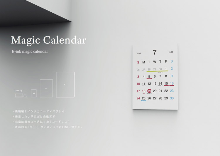
The Magic Calendar by Kosho Tsuboi, is a beautiful e-paper calendar that syncs with a smartphone to display your schedule and lot more. The project is associated with Google’s Android Experiments and hopefully we will see it live.
This is so cute and i love to have it.
iGizmo reaches gadget lovers with new digital experiences
The iGizmo team at Dennis Publishing describes how Digital Publishing Suite helped it top the iTunes charts, increase its readership and develop advertising partnerships using engaging reading experiences.
Video: iPhone interactive billboard in Stockholm
Well this is awesome and pure fun. Pick n ‘Play is an interactive game from McDonald’s. Watch the above video you will love this 😉
I LUV UXDESIGN
You love good UX design and like to know who are UX designers, have a look to these nice animation, spread the love 🙂
“Al Gore’s Our Choice” A next-generation digital book by Mike Matas
Mike Matas demos the first full-length interactive book for the iPad — with clever, swipeable video and graphics and some very cool data visualizations to play with. The book is “Our Choice,” Al Gore’s sequel to “An Inconvenient Truth.”
Our Choice will change the way we read books. And quite possibly change the world. In this interactive app, Al Gore surveys the causes of global warming and presents groundbreaking insights and solutions already under study and underway that can help stop the unfolding disaster of global warming. Our Choice melds the vice president’s narrative with photography, interactive graphics, animations, and more than an hour of engrossing documentary footage. A new, groundbreaking multi-touch interface allows you to experience that content seamlessly. Pick up and explore anything you see in the book; zoom out to the visual table of contents and quickly browse though the chapters; reach in and explore data-rich interactive graphics.
It’s available in Apple itune store.

Apple iPad Magazine “Boundless Beauty”
Another beautiful example of Apple iPad magazine using the Adobe Digital Publishing Suite.
“Living created its 20th anniversary “Boundless Beauty” special edition using the Adobe Digital Publishing Suite. With high-impact design and stunning photography, the digital edition uses Adobe tools and viewer technology to create an immersive, cinematic experience with interactive content and advertising.”
I am curious can we used Adobe digital publishing for iPhone development!!.
vivek
SMS Graffiti
Watch this video i found it very interesting, how mobile SMS can be used as a graffiti 🙂
vivek
Mag+ live with Popular Science+ digital magazines on Apple ipad
Just received an email from Bonnier, very exciting new Mag+ concept for digital magazines on Apple ipad. I posted about it in my previous post as it was in beta prototype and i like this concept very much. They have taken the first step building a Popular Science digital magazine for the iPad.
“Our design vision has been to avoid what our friends at BERG call “a wrist screen running clock software†– we wanted to build the watch. It should feel like you are touching the actual magazine, using your natural body language – not looking through the screen and layers of buttons.”
“Magazines are a luxury that readers can lose themselves in. We have built a digital magazine for a device you can curl up with on the coach. It allows readers to lean back, away from the browser, and just focus on the bold images and rich storytelling. We wanted to build a linear story with a beginning and end. Because we believe that reduced complexity increases your immersion. And that the sense of completion is important. ”
The Popular Science+ digital magazine features simple, fluid swiping motions let readers move horizontally through stories, while vertical scrolling allows them to read an article without interruption or distraction. In the app’s unique Look mode, users can tap the screen to make the words disappear, highlighting the magazine’s big, bold photos and illustrations. Another tap returns to Read mode.
The Bonnier Mag+ platform and the Popular Science+ magazine are based on 6 design principles:
- Silent mode: Magazines are a luxury that readers can lose themselves in. Mag + has fewer distractions than the Web. It allows readers to lean back, away from the browser, and just focus on the bold images and rich storytelling. Reduced complexity increases a reader’s immersion.
- Fluid motion: Magazines are easy to browse, and Mag+ replicates that with a story-to-story navigation that’s more like a panning camera than a flipping page. As we say, “Flow is the new flip.”
- Designed pages: Magazines are defined by their carefully conceived layouts that give readers an immediate understanding of the content and why it matters to them, a quality that got lost on magazine Web sites. Mag+ brings design back to digital publishing.
- Defined beginning and end: Unlike the Web, magazines have a defined storyline and flow from front to back. Mag + returns to the notion that something can be, and wants to be, completed. It’s the end of endlessness.
- Issue-based delivery: One of the great joys of magazines is that feeling of anticipation when a new one arrives. Mag+ maintains that by delivering full issues at once with all the same content as the print edition, and on the same schedule.
- Advertising as content: Relevant, attractive advertising is as much a part of the magazine experience as the editorial content, and Bonnier wants Mag+ advertising to include both pin-ups and applications readers can appreciate.
If you have ipad you can download it via itunes here.
vivek
Abstract UI: beautiful User interface for mobile
Another beautiful User interface for mobile by TAT, experimental but displaying information in beautiful ways is a huge challenge! Look in to the above video, you will know why i am speaking about it 😉 Day by day data visualization is getting big in picture and many ways to look around them. Here we also need to put our thoughts on how we can make complex things simple to the user. It doesn’t matter what technologies we are using it ultimately final user experience matters a lot.
“We are used to busy idle screens. Information such as missed calls, received messages, widgets on top of your customizable background wallpaper is all trying to get your attention. This is a new take where we go from very precise information to the idle screen as an entity, an abstract map of information. The idle screen will paint and evolve during the day and once you’ve learned its language you will get a whole lot of information just by giving it a glance.”
information is beautiful 🙂
vivek
Get to know Flash Lite for the Digital Home
Via Dale, another great video on “Flash Lite for the Digital Home” is the jumping point for application developers to move their existing skills and experience onto an entirely new screen – the TV! In this episode we outline the fundamentals of understanding Flash for TV, and some of the things developers will need to consider.
vivek
Latest Podcast showing Flash Lite and Flash Home Apps. very cool :)
Via Biskero, John Agger from Adobe’s Mobile Division Adobe’s latest Podcast showing Flash Lite and Flash Home Applications focused around major brands such as Nickelodeon, Nasdaq, and Barcardi. very cool 🙂
vivek