Visualization: Left Brain vs Right Brain by Mercedes Benz

I saw this quite long back and whenever i see it again, this visualization always fascinates me.

Left brain: I am the left brain. I am a scientist. A mathematician. I love the familiar. I categorize. I am accurate. Linear. Analytical. Strategic. I am practical. Always in control. A master of words and language. Realistic. I calculate equations and play with numbers. I am order. I am logic. I know exactly who I am.

Right brain: I am the right brain. I am creativity. A free spirit. I am passion. Yearning. Sensuality. I am the sound of roaring laughter. I am taste. The feeling of sand beneath bare feat. I am movement. Vivid colors. I am the urge to paint on an empty canvas. I am boundless imagination. Art. Poetry. I sense. I feel. I am everything I wanted to be.

“Al Gore’s Our Choice” A next-generation digital book by Mike Matas

Mike Matas demos the first full-length interactive book for the iPad — with clever, swipeable video and graphics and some very cool data visualizations to play with. The book is “Our Choice,” Al Gore’s sequel to “An Inconvenient Truth.”

Our Choice will change the way we read books. And quite possibly change the world. In this interactive app, Al Gore surveys the causes of global warming and presents groundbreaking insights and solutions already under study and underway that can help stop the unfolding disaster of global warming. Our Choice melds the vice president’s narrative with photography, interactive graphics, animations, and more than an hour of engrossing documentary footage. A new, groundbreaking multi-touch interface allows you to experience that content seamlessly. Pick up and explore anything you see in the book; zoom out to the visual table of contents and quickly browse though the chapters; reach in and explore data-rich interactive graphics.

It’s available in Apple itune store.

Designing distributed Multi-Device experiences

Designing distributed Multi-Device experiences

“Devices have outgrown one-size-fits-all design. Experiences must be selectively adapted only where they are relevant, and flow together across a series of devices and contexts. In a multi-device world, continuity is the new consistency.”

Punchcut has published an article and few set of guidelines for the design of distributed / multi-device experiences:

1. Understand the digital ecosystem, its organisms and relationships
2. Focus on distribution, not duplication
3. Adapt experience touch-points to each context
4. Embrace the concept of services, not applications
5. Establish frameworks to provide flexibility
6. Take the time to get the details right
7. Seek to evolve and enhance relationships

Read more

You can also watch the above video “One Size Does Not Fit All” which talks about methods for uncovering the unique opportunities that emerge when designing for convergence.

vivek

Wired Magazine’s iPad Edition Goes Live, have a look :)

Wired’s first digital edition is now available for the iPad and soon for nearly all other tablets. I have post about it earlier and find it cool. Interesting thing is they mention this app is designed to deliver rich reading environment, using new digital publishing technology developed by Adobe. 🙂
In case you don’t know Apple Won’t allow flash on iphone!!.

Wired is finally, well, wired. Have a look.

vivek

Designing for Mobile in India?

Designing for Mobile in India

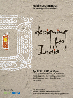
Mobile Design India’s first event  focuses on the theme of “Designing for India”
The Indian market is a unique mobile innovation playground and untapped opportunity for anyone wanting to develop mass-market mobile experiences that needs to work across a myriad of languages, operators, income-segments, networks and user needs. Mobile has revolutionized the way people conduct business, get entertained, educated, married, to keeping up with cricket scores.

On one side the Indian masses go for “aspirational” experiences that make them stand out. At the same time the core offering of simplicity, universality and easy access has never been more important than the present, where all pc-based experiences from the developed world are already being leapfrogged by being made available directly on mobile in the places like India.  There are fewer legacies in markets like India. Mobile developers and designers have a wonderful opportunity to push for new behaviours, interactions and experiences.

This group is co-founded by Priya Prakash from Nokia, and she is planning the group’s first event. The event will focus on 4 companies/startups that are crafting mobile user experiences thus taking advantage of the Indian market mobile opportunity and challenges.

When: 29th April from 6:30pm onwards
Where: @ Jaaga | Rhenius Street, Off Richmond Road, Opposite the Hockey Association Stadium main gate, Shanthinagar, Bangalore.
Register here: http://tech.groups.yahoo.com/group/mobiledesignIN/

If you think designing for devices which is something you are passionate about, this is the right place and i am very excited about this event and hoping it will make big. 🙂

vivek

Mag+ live with Popular Science+ digital magazines on Apple ipad

Just received an email from Bonnier, very exciting new Mag+ concept for digital magazines on Apple ipad. I posted about it in my previous post as it was in beta prototype and i like this concept very much. They have taken the first step building a Popular Science digital magazine for the iPad.

“Our design vision has been to avoid what our friends at BERG call “a wrist screen running clock software” – we wanted to build the watch. It should feel like you are touching the actual magazine, using your natural body language – not looking through the screen and layers of buttons.”

“Magazines are a luxury that readers can lose themselves in. We have built a digital magazine for a device you can curl up with on the coach. It allows readers to lean back, away from the browser, and just focus on the bold images and rich storytelling. We wanted to build a linear story with a beginning and end. Because we believe that reduced complexity increases your immersion. And that the sense of completion is important. ”

The Popular Science+ digital magazine features simple, fluid swiping motions let readers move horizontally through stories, while vertical scrolling allows them to read an article without interruption or distraction. In the app’s unique Look mode, users can tap the screen to make the words disappear, highlighting the magazine’s big, bold photos and illustrations. Another tap returns to Read mode.

The Bonnier Mag+ platform and the Popular Science+ magazine are based on 6 design principles:

  1. Silent mode: Magazines are a luxury that readers can lose themselves in. Mag + has fewer distractions than the Web. It allows readers to lean back, away from the browser, and just focus on the bold images and rich storytelling. Reduced complexity increases a reader’s immersion.
  2. Fluid motion: Magazines are easy to browse, and Mag+ replicates that with a story-to-story navigation that’s more like a panning camera than a flipping page. As we say, “Flow is the new flip.”
  3. Designed pages: Magazines are defined by their carefully conceived layouts that give readers an immediate understanding of the content and why it matters to them, a quality that got lost on magazine Web sites. Mag+ brings design back to digital publishing.
  4. Defined beginning and end: Unlike the Web, magazines have a defined storyline and flow from front to back. Mag + returns to the notion that something can be, and wants to be, completed. It’s the end of endlessness.
  5. Issue-based delivery: One of the great joys of magazines is that feeling of anticipation when a new one arrives. Mag+ maintains that by delivering full issues at once with all the same content as the print edition, and on the same schedule.
  6. Advertising as content: Relevant, attractive advertising is as much a part of the magazine experience as the editorial content, and Bonnier wants Mag+ advertising to include both pin-ups and applications readers can appreciate.

If you have ipad you can download it via itunes here.

vivek

2 Comments

Digital Magazines concept: Bonnier Mag+ Prototype

Bonnier R&D Mag+ Prototype

Bonnier R&D’s Mag+ Prototype

Bonnier R&D’s Mag+ Prototype

Bonnier R&D’s Mag+ Prototype

Elegant button free mockup, you can see the above video, its a great insight into how we consume magazines.This conceptual video is a corporate collaborative research project initiated by Bonnier R&D into the experience of reading magazines on handheld digital devices. It illustrates one possible vision for digital magazines in the near future.

The concept aims to capture the essence of magazine reading, which people have been enjoying for decades: an engaging and unique reading experience in which high-quality writing and stunning imagery build up immersive stories.

The concept uses the power of digital media to create a rich and meaningful experience, while maintaining the relaxed and curated features of printed magazines. It has been designed for a world in which interactivity, abundant information and unlimited options could be perceived as intrusive and overwhelming.

I would like to hear from you, your experiences, what you like to see in upcoming digital reading experiences. Do you really think Apple ipad can be a game changer in industry! Do people really love reading magazines in handheld digital devices?

vivek

1 Comment

Adobe Devnet Article : Design tips for creating mobile RIAs

Design tips for creating mobile RIAsDesign tips for creating mobile RIAs

A new article posted in Adobe Devnet by Dave Zuverink on “Design tips for creating mobile RIAs”.

He talks about the considerations and importance of Mobile RIA, how your app provides the most compelling experience possible to the user? and shared some of the great tips for achieving it.

“The opportunities and limitations of the mobile experience have been in flux for the last several years. At some points it seemed that browsers would become the primary means of delivering content. Then the development of “app stores” came to define what is expected of a mobile experience. Largely, these trends were shaped by the technologies available at the time. This has been especially true when it comes to delivering mobile experiences through browsers. Initially, due to network limitations, only very stripped-down WAP-style versions of websites were possible. Then full HTML browsers offered the promise of accessing the same desktop websites from mobile devices. However, while desktop websites offer a higher degree of richness, they are more difficult to navigate on a device.

With the proliferation of smartphones, many sites are now offering HTML sites that are specifically designed for mobile devices. While these sites offer an improvement over WAP sites, I believe there is an opportunity to build sites that deliver the richness of immersive desktop experiences that users expect, but are tailored for mobile devices.”

Now we have the power of Flash 10.1 on various new devices. So its interesting and long way to go.

vivek

Inspiring: A Peek at the Future of Interactive Storytelling!

iphone interactive storytelling book

“I was completely blown away by this video the first time through. Such a simple, low-tech, solution produces such an amazingly rich, engaging experience that’s just bursting with possibility for further creativity.
While it’s just a concept at this point, you can see how it can make a new kind of storytelling available to the masses in a way that wouldn’t have seemed possible not that long ago.” via everydayux

“It’s the hybrid book which combined iPhone and an ordinary book.  You can enjoy interactive actions there, by touching the screen or tipping the book as you read it.”

“The keyword of Phone Book is “Analog on the Digital Technology”; it combines digital value of iPhone and analogue advantage of books. This new approach will be able to apply to leaflet / catalogue for business use, art book, picture book or educational tool. It’s also possible to utilize ordinary movies / pictures instead of iPhone application.”

You can find some more info here in Japanese.

vivek

Video: Peek behind the curtain of Nokia’s design studio in London :)

“Over the past month we’ve been granted rare access, fascinating insight and candid chat related to a bunch of innovative design projects taking place at Nokia’s design studio in London. It’s certainly one of the Nokia hotspots for design innovation. From gesture and homescreen ingenuity to icon creation and the craft of “making communication more human” (as told to us recently by Axel Meyer, head of Nseries design at Nokia), our recent exposure to the design studio in London has painted an engrossing picture of what happens behind the curtain and how the people at Nokia holding the crayons go about bringing new devices and experiences to life.”

You can watch here a collection of recent videos featuring some of the passionate and creative folk at the Nokia design studio in London. Get a glimpse of how it all happens and some of the thinking behind a number of recent design projects.

Awesome and inspiring to see how they works 🙂

vivek